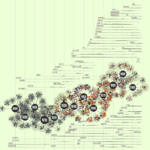
Data is a yucky word. As an English Major, I much prefer the word villanelle and sestina and personal narrative. But enough about that. For my data visualization, I chose a picture that represents writing–more specifically, a DV depicting Popular Science magazine’s 138 year history. How can you show over 130 years worth of history you ask? Quite elegantly, in fact. Jer Thorp, a data designer, produced the following image for PopSci:
It is a truly beautiful representation of something that most of us don’t think about–magazine words and representative words and color. The size of the “atoms” represents magazine word count, the colors represent the dominant colors used in each issue, and the words used frequently are repeated in the side. Truly a magnificent, and beautiful, set of data.


